This help article originally appeared on the StoragePug Blog here.
The key to good website design is focusing on a limited number of objectives for your users. For a self storage website there are two absolutely necessary functions, and then are a few optional functions that are nice to have.
The Purpose of a Self Storage Website
The two features a self storage website must address are online bill pay and online rentals. Although it's important to leverage online marketing, current tenants have needs too! Give them an easy way to pay from their phone. Combining online bill pay and SMS reminders is a recipe to reduce delinquency. To go a step further, it should be easy for your tenants to sign up for autopay.Online marketing is not nearly as effective if it isn't easy for a potential customer to become a current customer. To this end, online rentals are of paramount importance. The best way to convert these leads on a website is an elegant design and easy online rental process. Pertinent information should remain visible throughout the process, the new customer should have expectations clearly set, and screen real estate should be maximized. The process should be equally easy to complete on all devices.
After covering the essential functionality, a great way to expand a self storage facility website design is to provide resources for current tenants and leads. For leads, providing a size guide or storage calculator can help ensure they know how much space to rent. For current customers, offering storage tips and a Frequently Asked Questions page provides them a way to have their questions answered easily and save managers' time.
Good Web Design is Good for SEO
Back in the day, ranking high in search was easy. It was as simple as stuffing all pages with keywords. Nowadays, hundreds of factors are taken into account when it comes to deciding search rank. Providing a good user experience on your website is essential to SEO. A good design is the catalyst to a good user experience.Maximizing Functionality Above the Fold
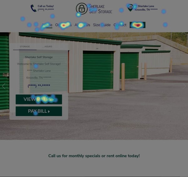
Unless someone is just surfing the internet on a whimsy, they probably want to spend as little time navigating a self storage website as possible. The best way to help users navigate a website faster is to maximize the actionability of the above the fold contents. To demonstrate, here is a heat map of clicks of Sherlake Self Storage with an above the fold marker for reference.
Conclusion
Online curb appeal is just as important as curb appeal in the physical world. The design of a self storage website needs to reflect the quality of the facility. A well-designed self storage website can be a funnel for new customers and a time saver for managers.
To read more about my favorite StoragePug features, take a look at The Importance of a Responsive Self Storage Website and Urgency Badge: Increase Online Conversion Rates.


