Responsive: it’s likely you’ve heard this term as it relates to websites. In case you don’t know what it means to say a website is responsive, it simply means that the website is designed to look great on any device. For some people, a tablet or mobile phone is the only way to access the internet. Regardless of what is available to any given individual, mobile usage on the internet is certainly on the rise. 2015 was the year where mobile search activity surpassed desktop search activity.
Google reported that in 2016 it processed 707 million queries for searches related to these keywords: “self-storage near me.” Sixty-three percent of those queries were initiated from mobile devices. Furthermore, 89% of people are likely to recommend a brand after a positive brand experience on mobile.
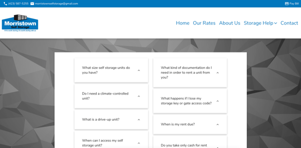
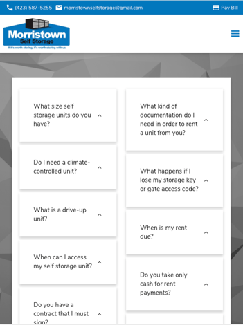
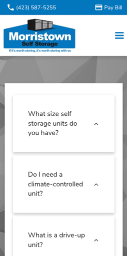
An example of mobile responsive design is this FAQ page design for Morristown Self Storage.
From my laptop:

Using my laptop, the FAQs are in two columns, centered within the page.
On a tablet:

On a tablet, the FAQs are still in two columns, but there is less white space. The two columns take up the full width.
On my phone:

Using a mobile phone, the FAQs collapse to one column. The right column sits flush under the left column.
A self storage facility's website should be equally functional on all devices for two main reasons:
The use of mobile devices to access the web is growing, including self storage.
Mobile responsiveness affects Google rankings.
The two primary things people want to do on a self storage facility's website are view rates or pay their bill. If they can't easily do these on their phone, that site might as well not even exist. If you are redesigning or freshly creating a self storage website (or any website for that matter), make sure the designer is taking a mobile-first approach.
To read more about my favorite StoragePug features, take a look at Self Storage Online Leasing or Customizable Email Alerts.


