Share your best features with visitors right on your homepage.
When a visitor comes to your self storage marketing website let them know more about your self storage business with ease.
On the average Web page, users have time to read at most 28% of the words during an average visit; 20% is more likely.
-Nielsen Norman Group
StoragePug's analytics over the last few years have shown that website visitors don't want to read lengthy copy. Rather they focus on images and videos.
Most website visitors spend only 15 seconds on your website.
At StoragePug we have carefully crafted our Self Storage Marketing Websites to user Feature-Driven Copy that your website visitors will engage with.

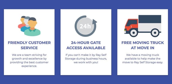
We take the time to find out what makes your Storage Facility special. Then our self storage web design team makes them into graphics that we display on the front page of your website for your visitors to see.
Example
We just launched a really fun website for Ray Self Storage. Take a look at some of the ways we were able to capture web visitors through Feature-Driven Copy.
Along with capturing your self storage facilities' top 3 amenities we also talk with you to find out what features your facility offers.
For Ray Self Storage our self storage web design team made logos for each feature. By having the feature icons we are no longer relying (better hoping) for people to read the copy. We have designed it to capture your web visitors attention!


